🖼️
The Layout
The layout of the application's interface consists of three main parts:
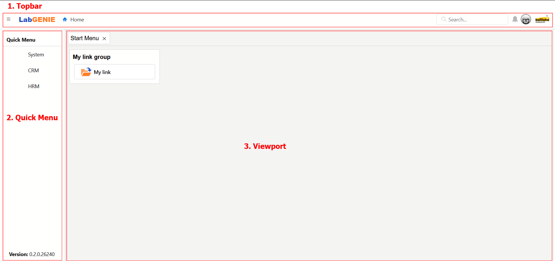
1. Top bar
The top bar is a toolbar which contains a variety of useful buttons and elements:
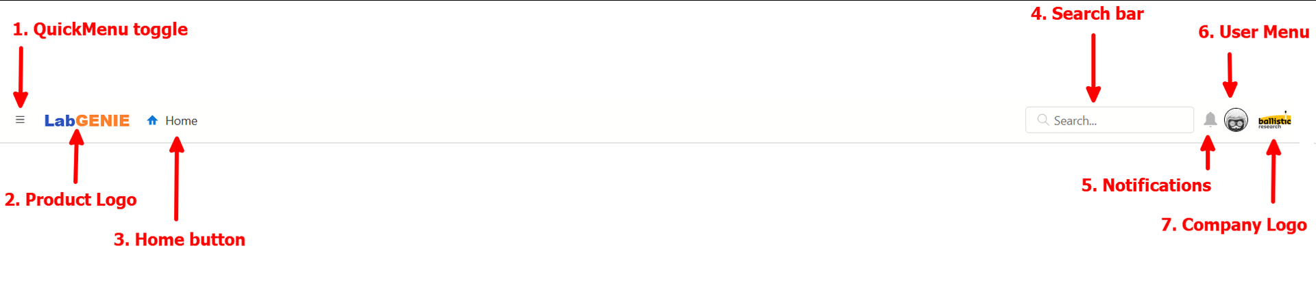
- The Quick Menu toggle allows you to collapse or show the Quick Menu side bar. The Quick Menu shares its space with the Viewport. Collapsing it will therefore give you more working space.
- The Product Logo can be clicked to navigate to the Start Menu.
- The Home button can also be clicked to navigate to the Start Menu.
- The Search Bar is currently not operational.
- The Notifications are currently not operational.
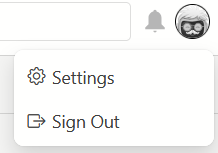
- The User Menu can be opened to navigate to the settings* page, or to sign out.
- The Company Logo (which is very useful as it allows you to navigate to the Start Menu when clicked) can be customized* to display the logo of your company.
*To learn more about the Settings page, read the associated article: ⚙️ Settings
*To customize the company logo for your deployment, please get in contact: ✉️ Getting support
2. Quick Menu
The quick menu allows you to quickly navigate to certain resources. Read the full documentation here: 🏃♂️ The Quick Menu
3. Viewport
The Viewport is the main content frame in which you as the user will find all your useful windows. You can read the full documentation here: 🖥️ The Viewport